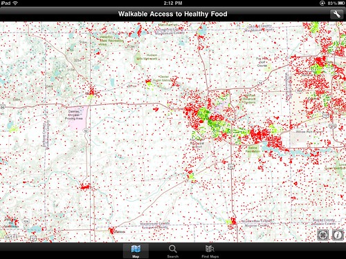
This is a topic that interests me personally but also has applications in my job. We've completed a similar analysis but the maps we created look comical compared to this one.

At first it looked extremely detailed and like it took a LOT of work to get all the data but on closer inspection it's not all that complicated.
With so many dots it's easy to think that each represents a household. It turns out that the dots actually represent areas. These points are called centroids and contain data for an area or polygon but are displayed as points. In this instance, the centroid represents census blocks. The census is notorious for suppressing all of the interesting information. Also, I don't recall a "can you walk to a supermarket from your house" question on the census form. So we know that none of the data came from the census, only the geography of the blocks, in this case, centroids. Fortunately, a layer of supermarkets is pretty easy to come by. Just like that we can easily account for two-thirds of the equation, census block centroids and the locations of supermarkets. A simple GIS selection will show the census blocks within a mile of a supermarket.
Now it gets tricky, and this is where I've struggled at work. How can you determine if residents of a particular household can walk to a supermarket? You can't. At least not on a large scale, like the entire US, you can't. The biggest factor is whether or not a sidewalk is available but it's impossible to trace a walking path from every house to the nearest supermarket. From a GIS standpoint the easiest layer to add in to this equation is sidewalks. A reasonable corner to cut to estimate walkability is to assume that if a census block has a sidewalk in it, you count it as being walkable. There are lots of exceptions but that is how I would do it.
However, I think this map cuts even more corners. I can tell you that no one has sidewalk data for the entire country...not even Google! It looks like the cartographer has assumed that urban areas, namely cities and villages, all have sidewalks.
So while this map implies amazing detail it is really a huge collection of assumptions and estimations. That's really ok, it gives a great snap shot of "walk access" for an area. The problem is, when you are trying to determine where to fill sidewalk gaps to allow more people walk access to fresh foods, you need to know if they actually have a place to walk, not just whether they live in a city and if there is a sidewalk somewhere near there home.
Still, it's an excellent point of departure for a more detailed analysis and map. I'm definitely a fan of the use of centroids for census blocks.
Kudos to Esri for creating an app that is more than I initially thought. If you have an iPad go get it, it's free!


No comments:
Post a Comment